Role: Product Designer
Team: PD, FE, BE, PM, Kambi partner, Head of Sportsbook
Timeframe: Feb 2018 to July 2018
Stage: Shipped
TL;DR
Casumo needed a sportsbook quickly. We partnered with Kambi to handle odds and core betting flows, then layered differentiation where it mattered: navigation, onboarding, and discovery. I led the UX work that turned constraints into product advantage. The horizontal sports rail, live toggle, and first-time personalisation all shipped. Sports became integral to Casumo’s business until Covid cancellations halted the market.
Background
Casumo was a casino-first operator looking to expand into sports. The mandate was speed: launch with Kambi’s white-label and still make the product feel like Casumo. The design challenge was clear — work within tight technical limits but give players a clear, intuitive way into sports.
Understanding the limitations
Casumo chose Kambi as the betting engine. It came with fixed templates for odds, betslip, and market views. That gave us speed, but also strict limits.
I mapped exactly what was untouchable (odds layouts, settlement logic) and what we could influence (navigation, entry flows, empty states, motion). The work became a study in constraint design: where to bend, where to accept, and where to overlay Casumo’s brand.
“Kambi’s default interface... functional but generic. The challenge was to create a Casumo experience without breaking the underlying engine.”

Discovery
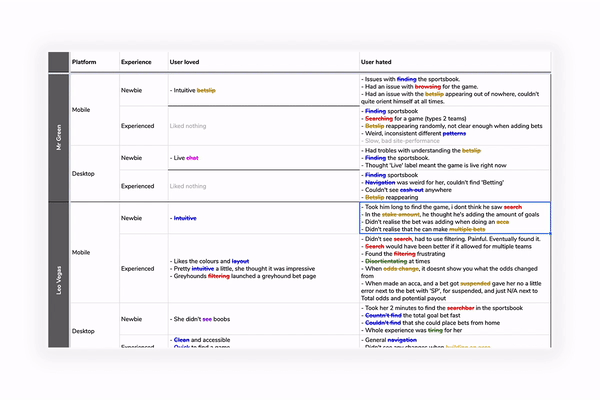
Competitive review
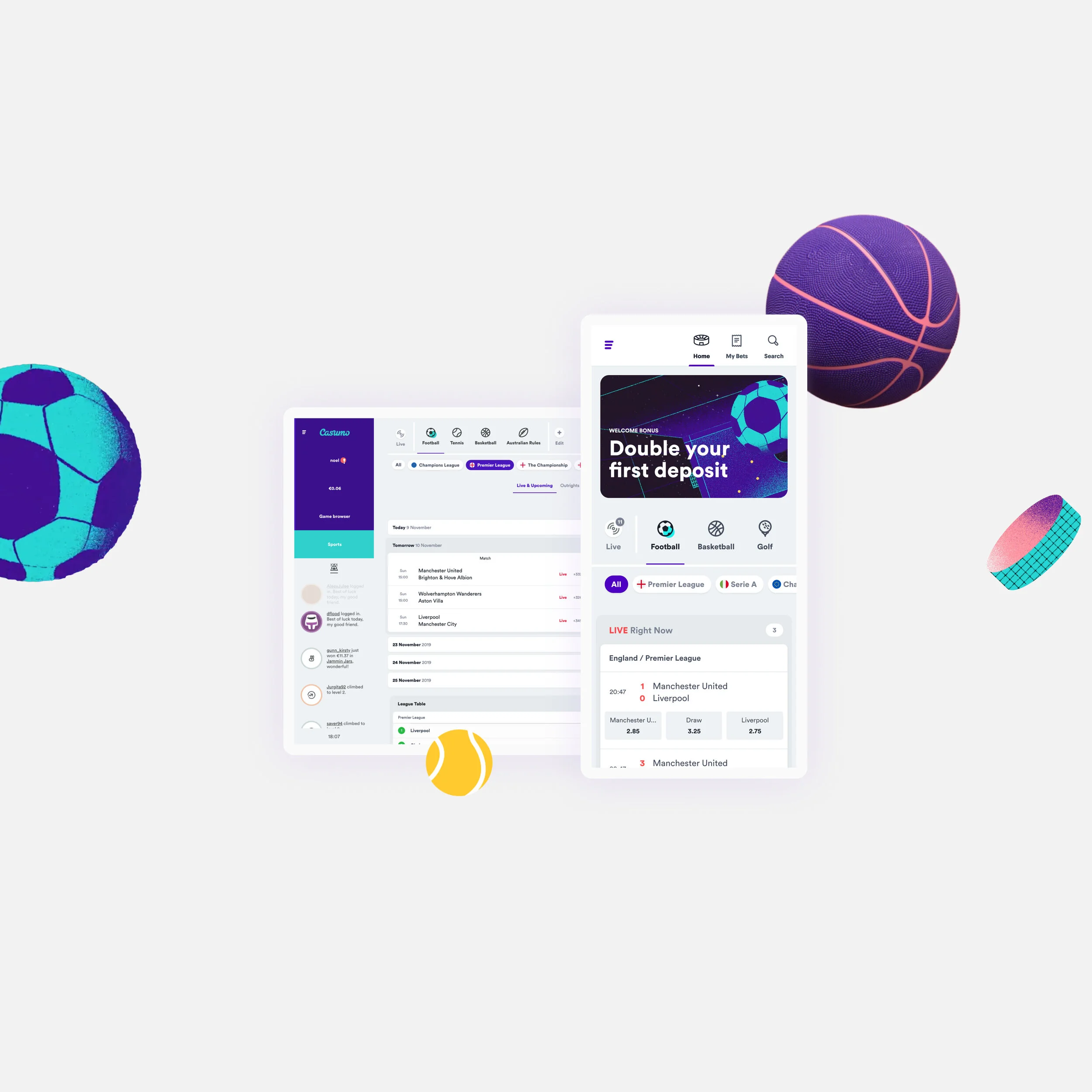
We mapped leading European sportsbooks. Most leaned on search and stacked menus, which made discovery slow. Live events often cluttered the experience. None invested much in onboarding. This gave us a chance to differentiate on clarity and first-time flow.
Interviews
Player interviews reinforced what we saw in competitors:
New users were overwhelmed by the number of sports.
Most preferred to browse rather than search.
Simple personalisation (choose favourite sports/leagues) was welcomed if optional.

Research insights
Key findings consolidated into three design bets:
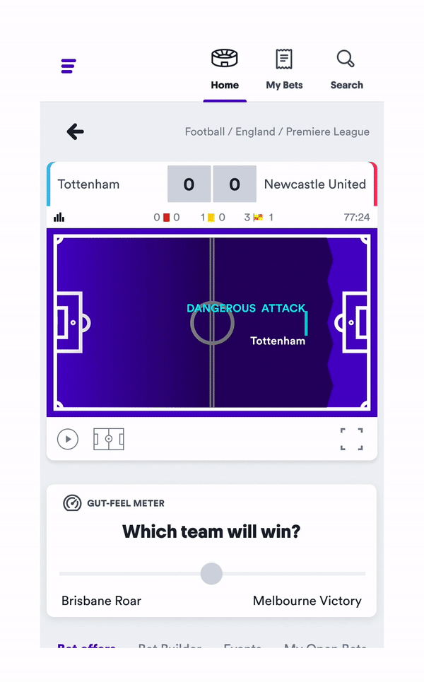
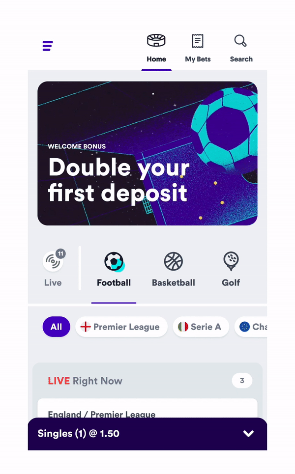
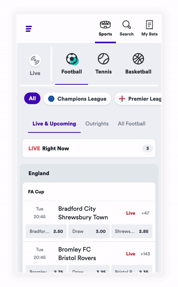
Horizontal navigation rail for scanability.
Prominent but simple surfacing of live events.
Lightweight onboarding to cut noise for first-time users.
Design process
Wireframes
I explored vertical vs horizontal navigation structures. Horizontal tested clearer and scaled better cross-device.
We added a short onboarding step to let players pick favourite sports/leagues, cutting noise from the home screen.
Prototypes
Prototyped multiple ways to highlight “Live.” Badges cluttered the UI; a toggle tested best for recognition and control.
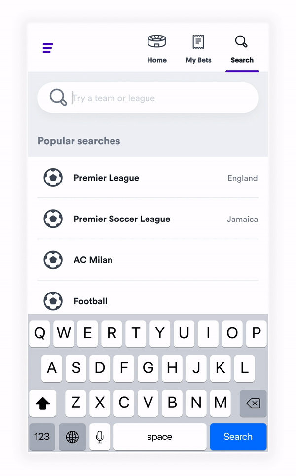
We also rebuilt search to match the casino experience, avoiding two different learning curves.
High-fidelity
Applied Casumo’s brand style within Kambi’s rigid templates. Focused on consistent navigation, clear hierarchy, and state handling (empty, loading, error).
Designed responsive layouts across mobile and desktop.
Final product
Horizontal sports rail shipped.
Live toggle shipped.
First-time personalisation shipped.
Search parity shipped.
Sports quickly became integral to Casumo, until Covid halted global events.


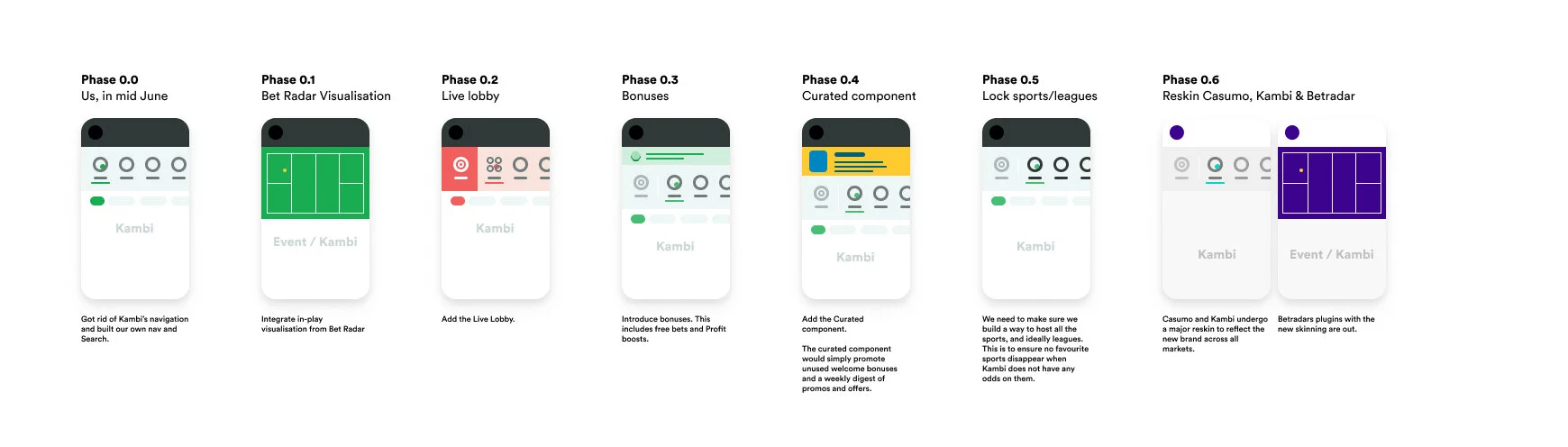
Release Plan


Results
Rapid adoption post-launch (figures confidential).
Browse consistently outperformed search as the main entry point.
I led design for navigation, onboarding, and live toggle; collaborated with FE to deliver within Kambi’s limits.
Learnings
Constraints can be leverage if you design around them.
In sports, browse > search — design discovery, don’t just bolt on search.
White-label doesn’t mean generic if you pick your battles carefully.